
NYU Albert Redesign
Courses Enrollment System Redesign
Duration
Nov. - Dec. 2021
Role
UX Researcher
UX Designer
Team
Eva Chen
Yen-Yi Huang
Tool
Google forms,
Figma,
Adobe Illustration
Project Overview
This redesign focuses on creating a smoother and easier course enrollment experience for over 50,000 NYU students using the NYU Albert platform.
Through research, we noticed that the current system was yet to be satisfying in terms of efficiency and intuitive interaction. Thus, we redesigned the system by reducing redundant steps, organizing a clearer information hierarchy, and improving page visualization.
A fully functional prototype was developed in December 2020, tested with 5 NYU students, and iterated.
For further development, we hope this system can not only assist students in enrolling in classes but also help them plan their future career path by adding personal analysis tools.
Research
Design Method

Current System Analysis & User Flow
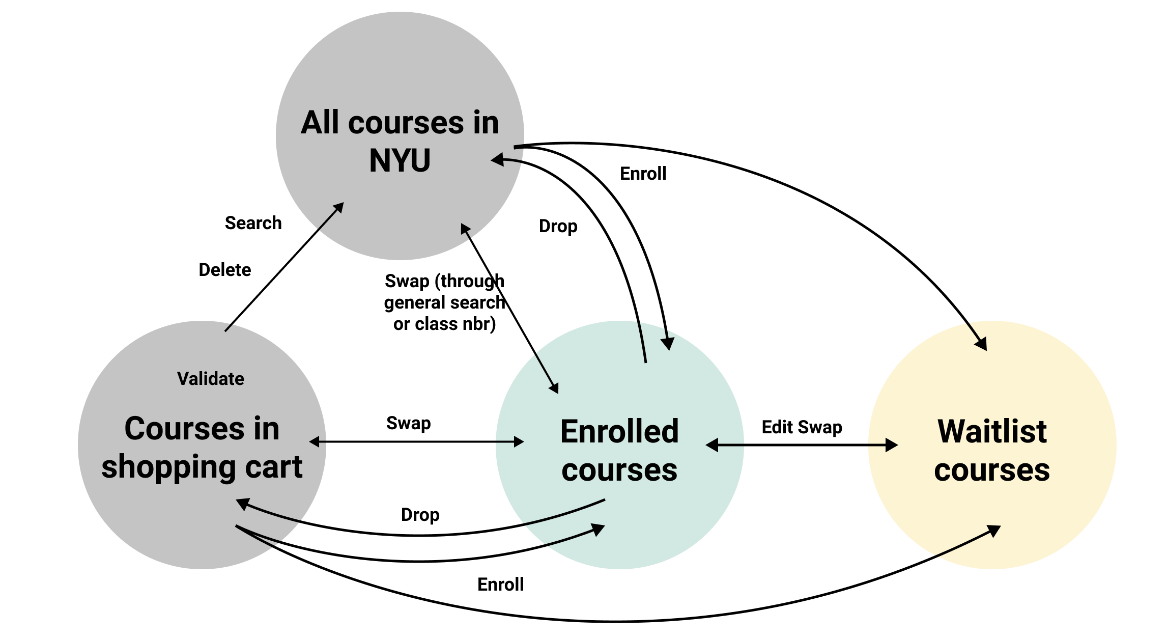
There were 8 main functions in the course enrollment process: search, enroll, validate, delete in the shopping cart, swap, drop, edit swap, and edit in enrolled courses.
We found several problems with it:
Confusion:
Each user flow for every function had stand-alone pages to complete the task, which resulted in similar pages that confused users.Not easy to use:
Users need to go through many duplicated steps and pages to finish the task without the going back option. This became a big problem when the user accidentally went wrong in the middle of the process because the user had no choice but to start all over again from the beginning.Hard to navigate:
The pop-up window page for choosing a course was unresponsive and difficult to navigate information.

Survey
36 surveys were collected
The survey had 4 sections of questions based on basic information, overall experience, and two major page ratings.
Those questions were oriented from 4 standard evaluations:
Intuitive interaction
The sufficiency of the information
The efficiency of use
Visibility of system status.
We found that ratings regarding intuitive interaction and the efficiency of use were the lowest. Students thought it was difficult to use the system and spent much more time than expected to complete the process.

Interviews
We conduct interviews to explore user needs more.
5 in-person: 3 undergrad & 2 graduate
We walked through their experience under different task situations.
We organized the information with an affinity map by observing their actions and listening to their answers to interview questions.
We found that about two-thirds of the complaints were related to the problems of low-efficiency use and unintuitive interface.
Low efficiency:
Time-consuming
Poor user flow
Long loading time
No flexibility in switching status
No visualization schedule
Hard to compare courses
Popr information display
Poor hierarchy
Too many contents
Duplicate content
Unintuitive:
Poor navigation expirence
unclear instruction
ambiguous buttons
No responsive windows
No guidance
The shopping cart function is confusing
Validating function is confusing and inconvenient

Conclusion
According to the research, the users think the enrollment system is inefficient and unintuitive. The fundamental problem is that the user flow is too complicated and redundant.
Persona

Problem Statement
HOW MIGHT WE…
make the course enrollment process more intuitive and efficient so that students can enroll in their courses effectively?
Design Solution
Ideation & Prototype
Efficiency
[General] Fewer steps to complete the tasks
[General] Clear user flow
[Course searching] Easy filter and comparison for courses
[Home page] Visualized course timetable
[Course selection] Clear courses information hierarchy
Intuition
A responsive window
Provide onboarding guide
Clear instructions and accurate button contents
Automatic validation
User Flow
To improve the user flow, we first prioritized the functions
Original Functions - 8 functions
Originally, there were 8 functions, including search, enroll, validate and delete in the shopping cart, and swap, drop, edit swap, and edit in enrolled courses.
New Functions - 5 functions
Based on research, we prioritized 5 functions, including search, enroll and delete in the shopping cart, and swap and drop in enrolled courses. In addition to that, validate function will be automatically validated by the system without manual operation.

Original Functions

New Functions
In the new user flow, we removed duplicated pages and created the wireframe

User Flow

Homepage
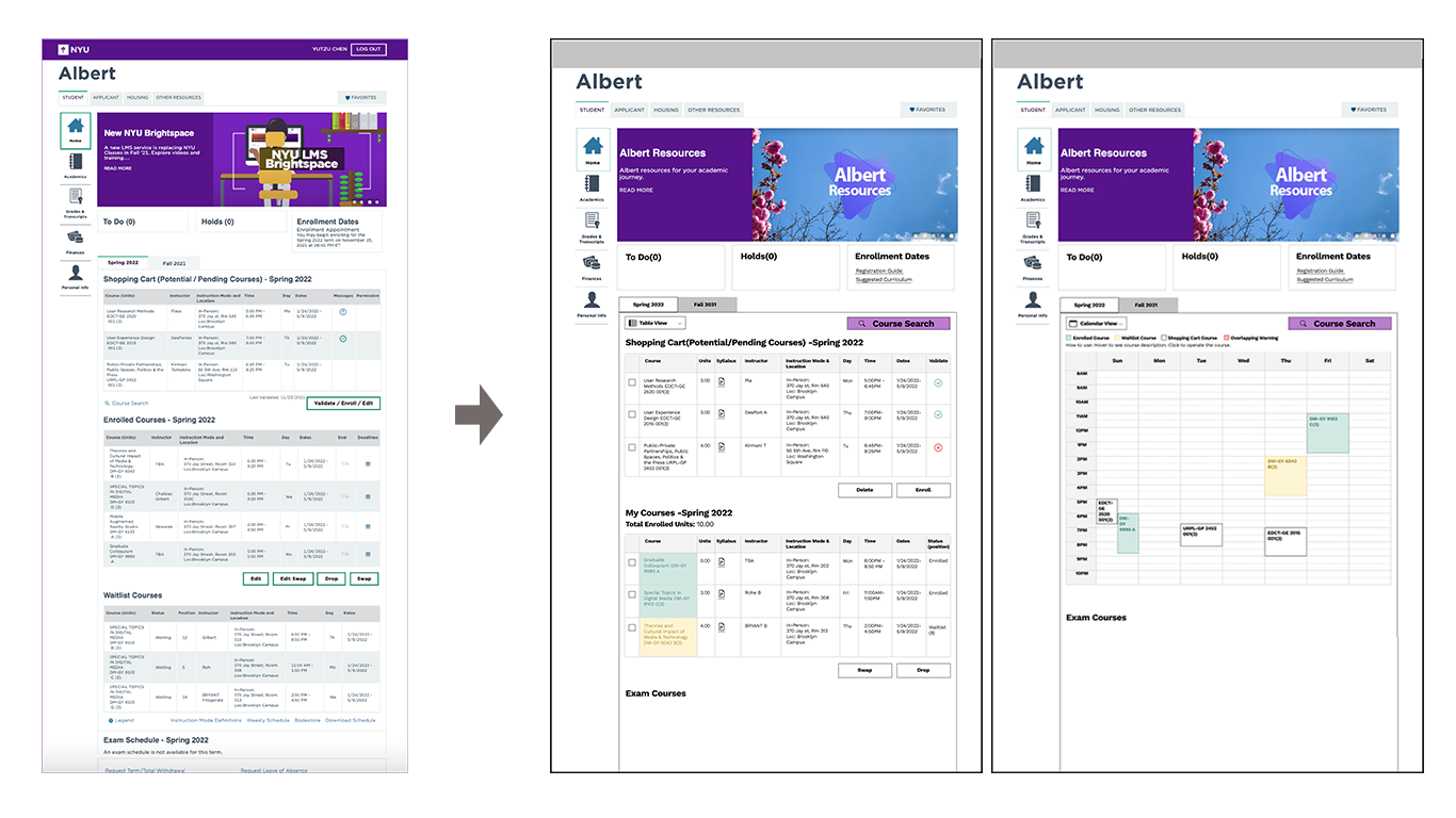
To be more specific, we focused on the main homepage and course searching pages, which students used the most. We made below major changes:
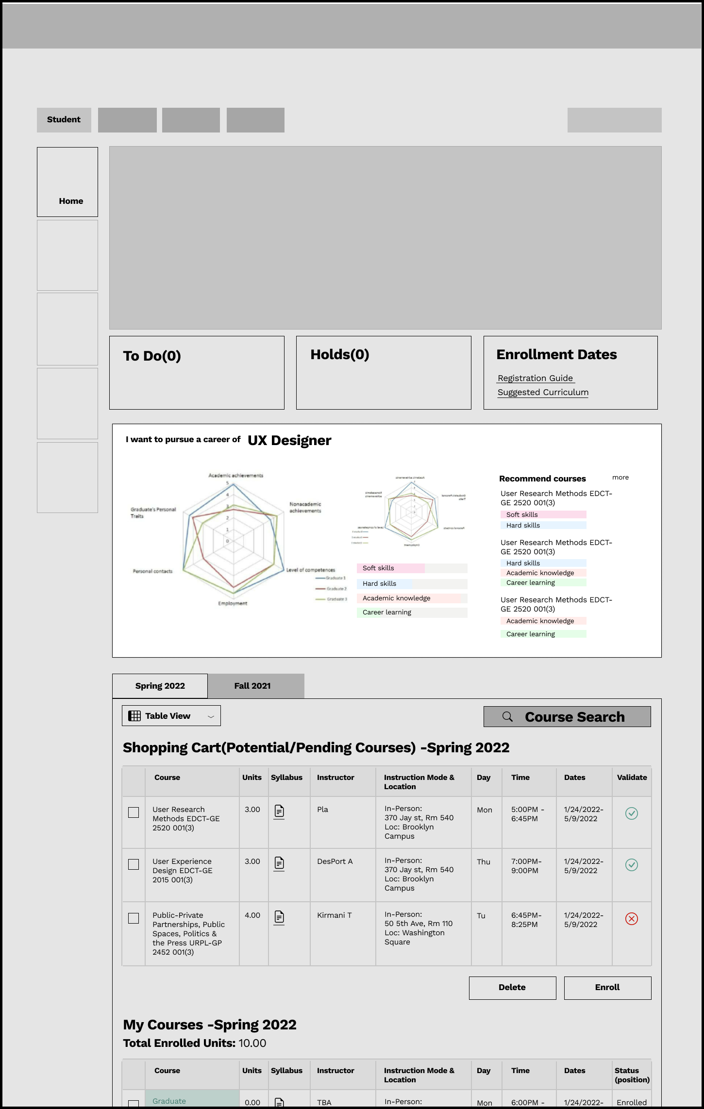
Add links to the curriculum & registration guide
Highlight the only course search button
Allow two-view (list view & calendar view) to switch for better visualization.
Combine two sections of enrolled courses and waitlist courses into one section of my courses.
Use color to distinguish different enrolling statuses for courses.
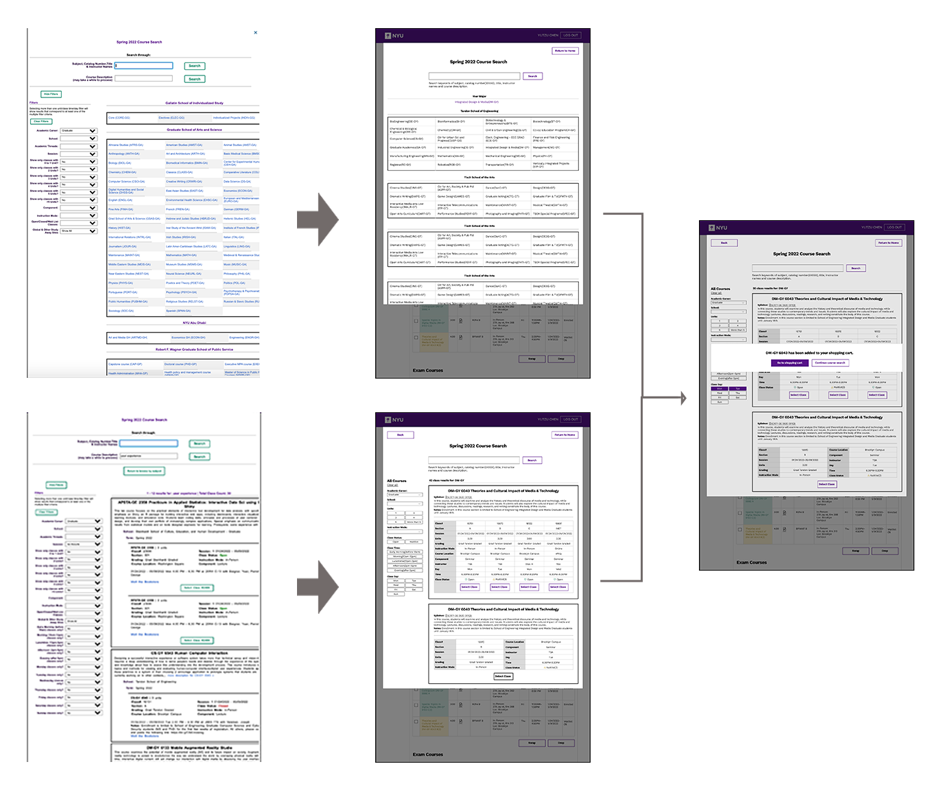
Course searching pages
The primary need of courses searching pages is the efficiency of use.
A responsive window
Easy-to-operate filter buttons
Reorganized course information into columns
Locate the user's major and school automatically and list them at the top.
User Testing & Iteration
After finishing the wireframe and final display, we tested the new system with 5 students and iterated a new design based on their feedback. According to our new design, the ratings for efficiency and intuitive interactions reached 4 out of 5.
Feedback for improvement:
1. correct some button texts, like changing "OK" to "Returning homepage."
2. More filter options on the calendar view so that the user can edit the calendar with their preference


Solution
1 Provide onboarding guide & hints
Step-by-step guidance for the first-time students
Provide links to registration guide videos
Word hints at important illustrations
2 Help find courses quickly
Highlight the only course search button
Simplify filters and make them intuitive with multi-select buttons
Locate the user's major and school automatically
3 Easy Comparisons of different sections for the same course
Aggregate duplicated information for the same course
Information is listed in order of importance
Section's information is listed in columns for easy comparisons
4 Provide visualized course schedule
Allow the user to switch between table and calendar view to check the schedule
Check course details by hovering the mouse
Operate swap/ delete/ drop function by clicking on each color block
Future Development
For future development, we hope to add personal analysis tools to help with students' career paths. With this tool, students could tailor their courses choice to their future careers by identifying required skills. They can gradually approach their desired jobs by choosing courses that equip them with the same skills they need.
Personal Analysis Tool

Learnings
For future development, we hope to add personal analysis tools to help with students' career paths. With this tool, students could tailor their courses choice to their future careers by identifying required skills. They can gradually approach their desired jobs by choosing courses that equip them with the exact skills they need.